AI Image Generation for Brands: Keeping Social Visuals Consistent
AI generates images; it does not keep your brand consistent. How to write a visual brief, why a fixed template matters more than any single image, and where real photography cannot be replaced.
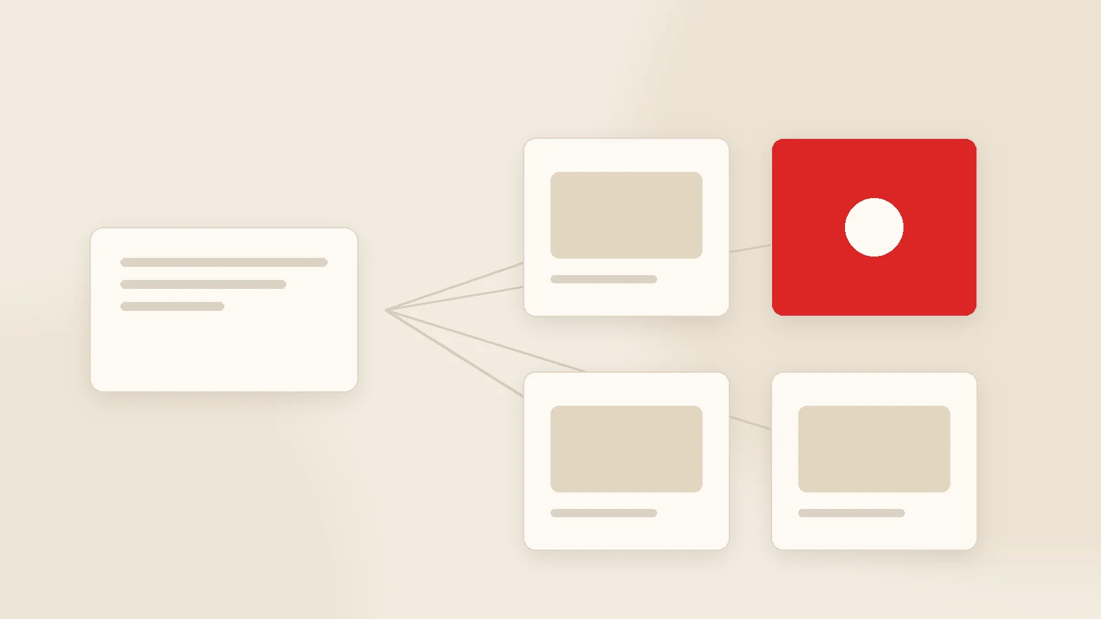
The point of AI image generation for a brand is not a beautiful image; it is a consistent one. The method: write a clear visual brief (subject, scene, framing, palette, dimensions), generate a few variants, choose one, and place it inside your brand template. Do not ask the model to write text into the image — add wording afterwards in your own typeface. And for anything showing your actual product, premises or team, nothing replaces real photography.
AI image tools took a leap over the past two years. But for someone scrolling a feed, the question is not how striking one image is — it is whether the account looks like it belongs to one brand. Thirty individually beautiful but unrelated images leave a worse impression than thirty plain, consistent ones.
This guide covers the visual brief, the template method, dimensions, the mistakes we see most often, and where real photography is non-negotiable.
The visual brief: six lines
- Subject: what it communicates, in one sentence.
- Scene: where it takes place, what objects appear.
- Framing: close-up, wide, overhead.
- Palette: brand colours plus background tone, with constraints written out.
- Empty space: where text will go — top, bottom, one side.
- Dimensions: 1:1, 4:5 or 9:16.
The most commonly skipped line is empty space. Forget it and you get a lovely image with nowhere to put the words.
The brand template: where consistency comes from
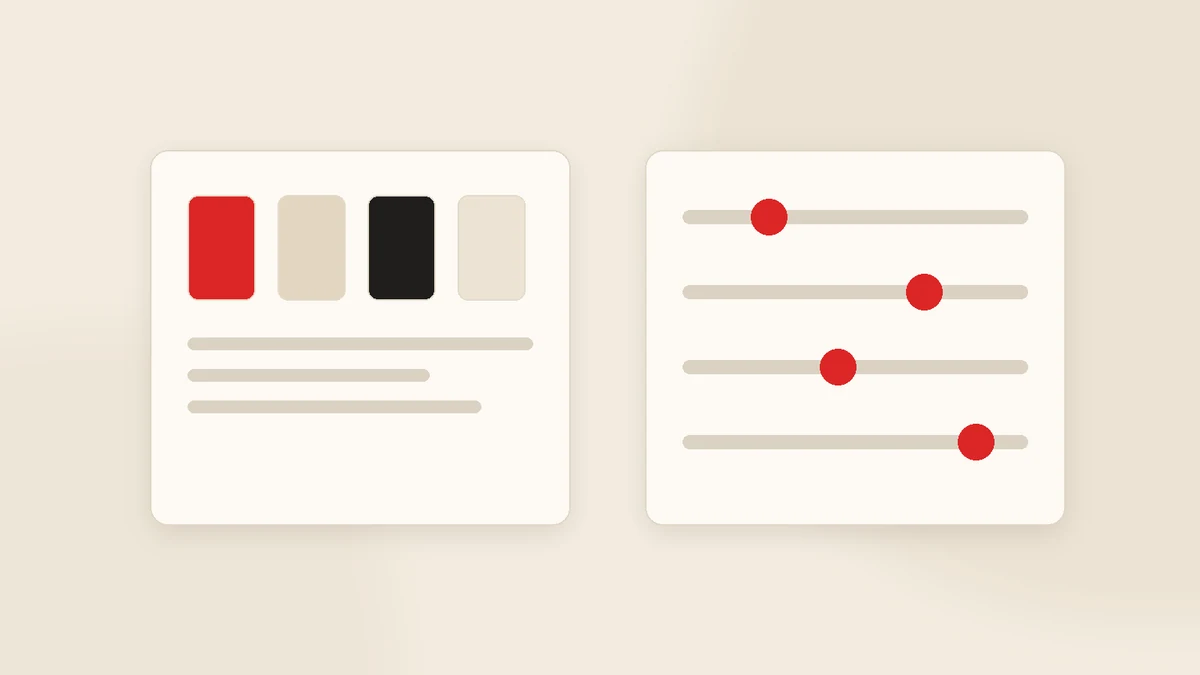
Consistency does not mean every image looking the same. It means a repeating frame. Three elements are enough:
Typography
One heading face, one body face, fixed size steps. Your typography, not the model's.
Colour
One background, one accent, one text colour — the same trio every time.
Layout
Logo always in the same corner, text on the same alignment, margins fixed.
Fix those three and the grid reads as one brand even as the imagery changes.
Dimensions
| Use | Size | Note |
|---|---|---|
| Feed (square) | 1080×1080 | Safe everywhere |
| Feed (vertical) | 1080×1350 (4:5) | More screen on mobile |
| Story / Reels | 1080×1920 (9:16) | Keep text out of top and bottom 15% |
| LinkedIn / Facebook link | 1200×627 | Horizontal |
| Carousel | 1080×1350 | All frames identical size |
Seven common mistakes
- Letting the model write the text. Misspellings and a mismatched typeface. Add wording yourself.
- A different style every post. One photoreal, one illustrated, one 3D — the grid falls apart.
- Generating the product itself. Customers want the real thing; a generated product shot misleads.
- Low contrast. If the text is unreadable on a phone, the post is wasted.
- Crowded compositions. You get about a second of attention; one focal point is enough.
- Protected elements. Other brands' logos, known characters and third-party photos do not belong in your visuals.
- Cropping after the fact. Generate at the right ratio instead of cropping a square into a vertical.
Where real photography is required
- The product itself.
- The premises — shop, workshop, office, site.
- The team and the process.
- Finished work and before-and-afters — the strongest social proof there is.
- Customer moments, with permission.
AI plays a supporting role in those posts: background cleanup, cover design, promotional compositions, repeating templates. A few genuine photographs a month change the tone of an entire account.
Ethics and transparency
Keep promotional imagery and product imagery separate. An image that makes a product look different from reality may attract attention now, but it returns as refunds and lost trust. Platforms are also applying their own rules on labelling generated content, so follow the current policy on the channels you use. We collected the wider risks in the risks of AI-generated content.
Our own software: Postuby
Postuby is Gurizon's own AI-powered social media platform. On the visual side it follows exactly the logic above: it generates the post image together with the copy using the colour, typeface and design rules in your brand profile, prepares carousel and vertical formats, produces reels covers and drops the content into the monthly plan.
That removes the usual chain of generating in one tool, downloading, adding text in a second and uploading to a third. See content generation and reels video production.
Conclusion
AI made producing images cheap. It did not make brand consistency cheap. Write a precise brief, fix the template, add text in your own typeface, and keep real photography for product, premises and people. Those four rules are also the answer to "why do all AI visuals look the same".
If you want us to build a visual template for your brand, send your logo and colours and we will prepare a sample set. Get in touch.
Frequently asked questions
How do you create social media visuals with AI?
Why don't AI visuals look like my brand?
What dimensions should social media visuals use?
Should I let the model write text inside the image?
When is real photography necessary?
Does Postuby generate visuals?
Related guides
Build a Monthly Content Calendar with AI in One Hour
Asking "what should we post today" every morning is what kills social media accounts. Here is how to produce a month's plan in one sitting and approve it on one screen.
Read the guide
Creating Instagram Stories with AI: Seven Formats and a Weekly Template
A story is not a vertical post; it does a different job. How to generate story sequences with AI, seven ready formats and a weekly template that removes the daily decision.
Read the guideWant to put this into practice?
Tell us about your project and get a written, fixed-price proposal within 24 hours. No sales pressure — if we are not the right fit, we will say so.